Simplifying period care through intuitive subscription management
Nua was innovating period care by easing the life of women during periods with easy to dispose covers and customizable period packs based on flow. However, app journey could not bring its story and was leading to severe drop-offs.
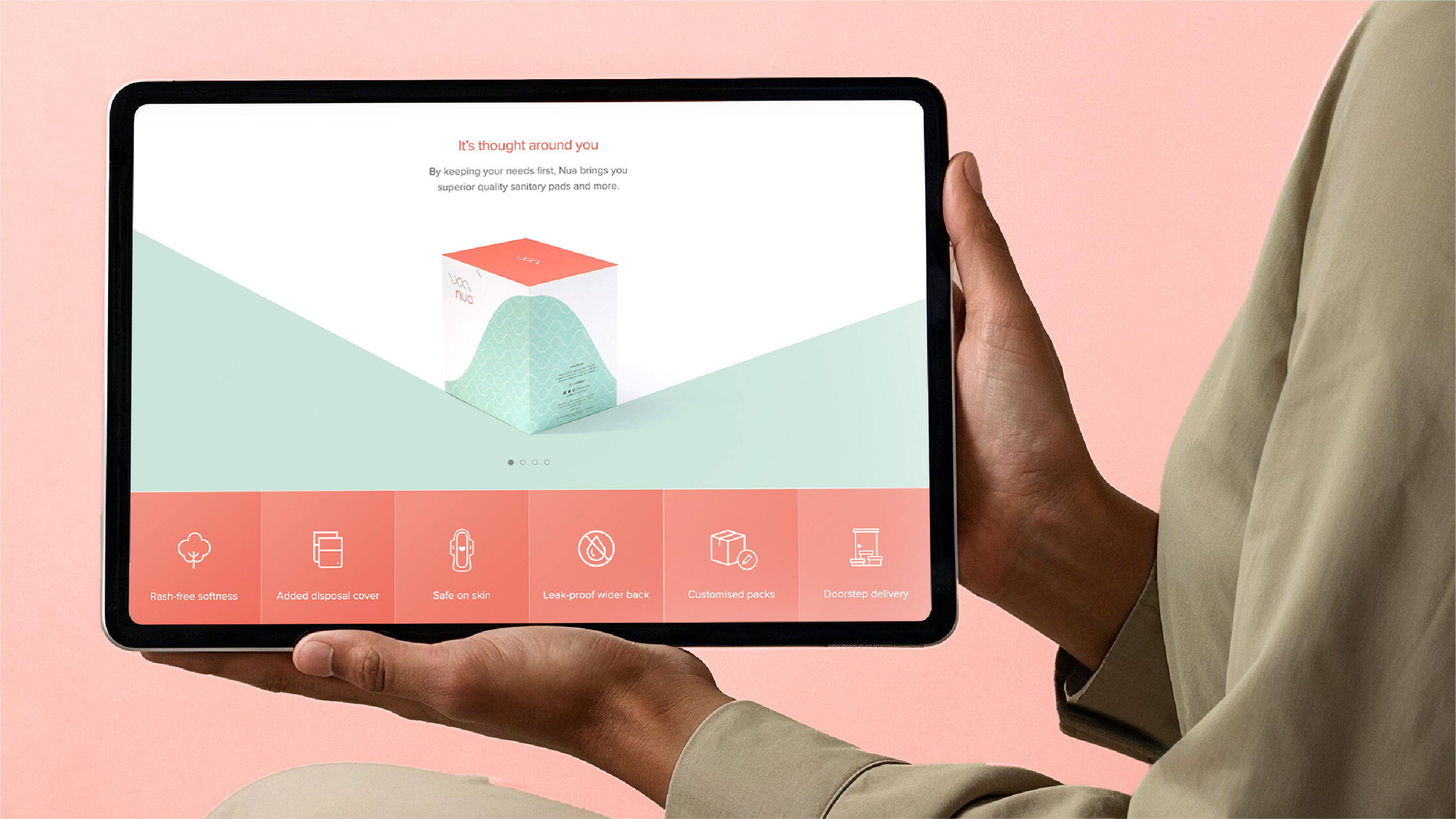
A powerful expression for the brand: Nua, thought around you. A brand that not only eases the life of women during periods but also helps them manage their periods.
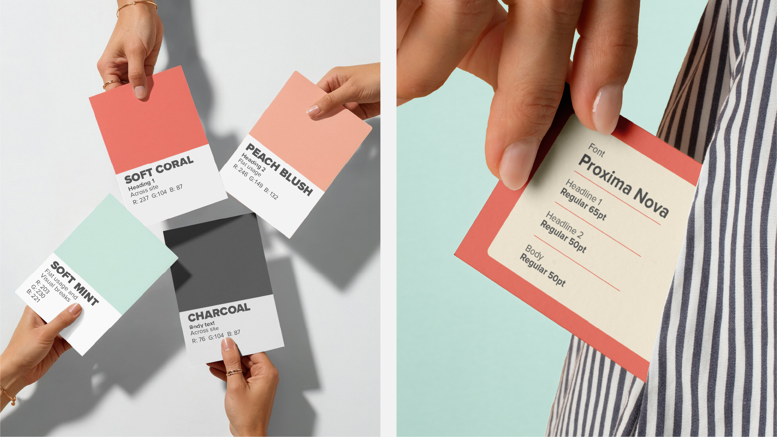
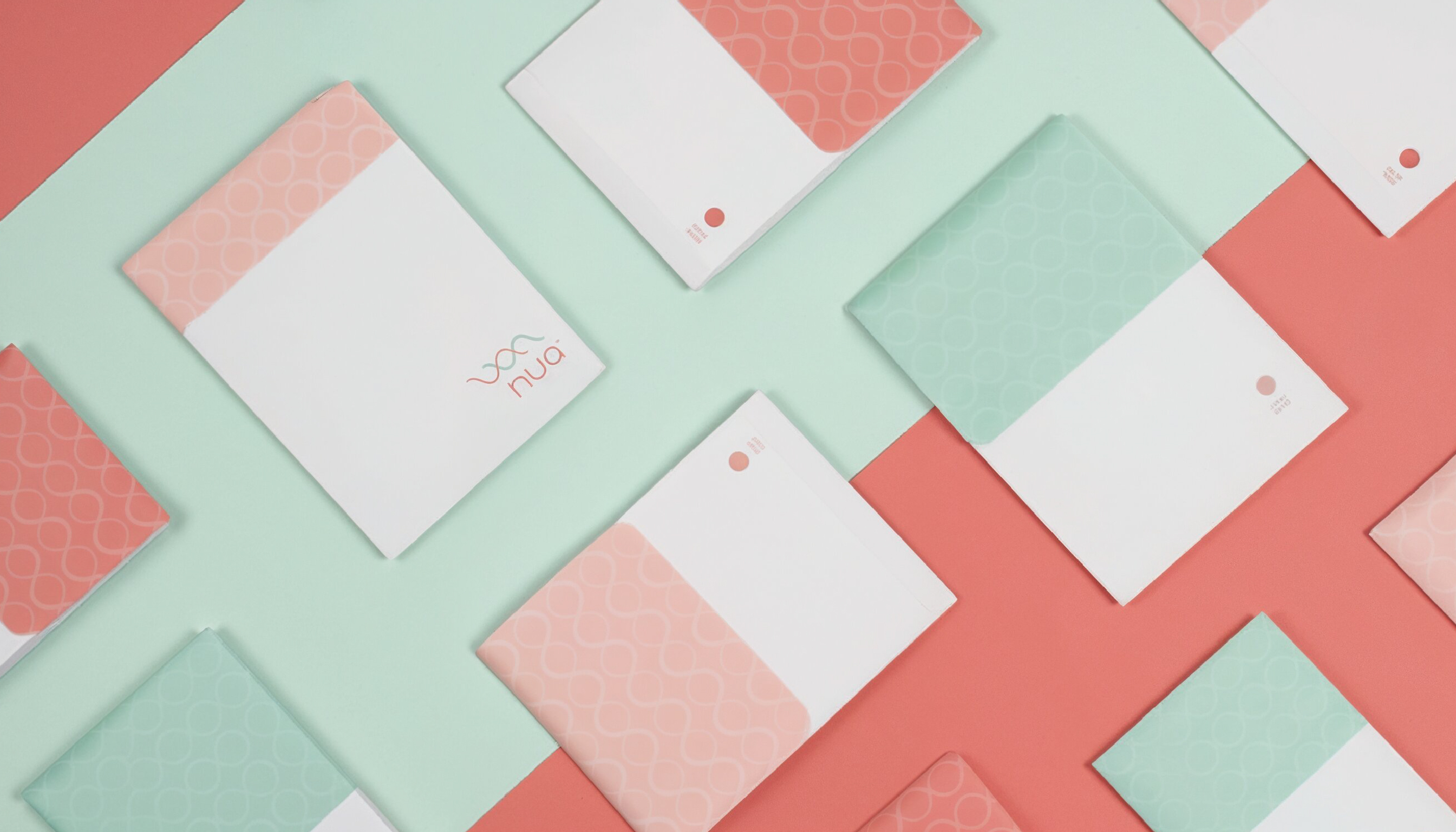
An approachable visual identity: Illustrative graphics, a coral and mint palette, and ample whitespace were employed to soften the clinical feel often associated with period care, while still ensuring maximum clarity.
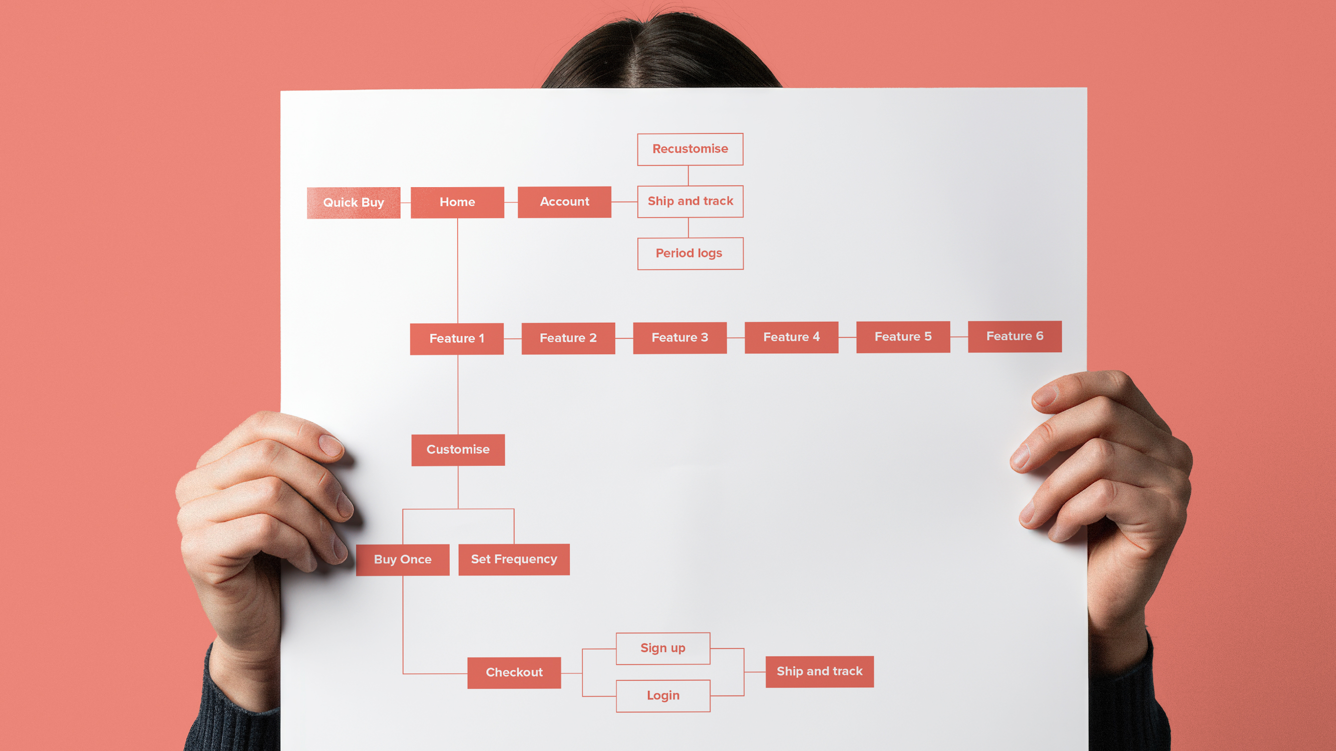
Simplified Information Architecture: Easy navigation structure that clearly brings out the Nua benefits upfront to the user, helps them customize and eases check-out frictions into a neat subscription journey
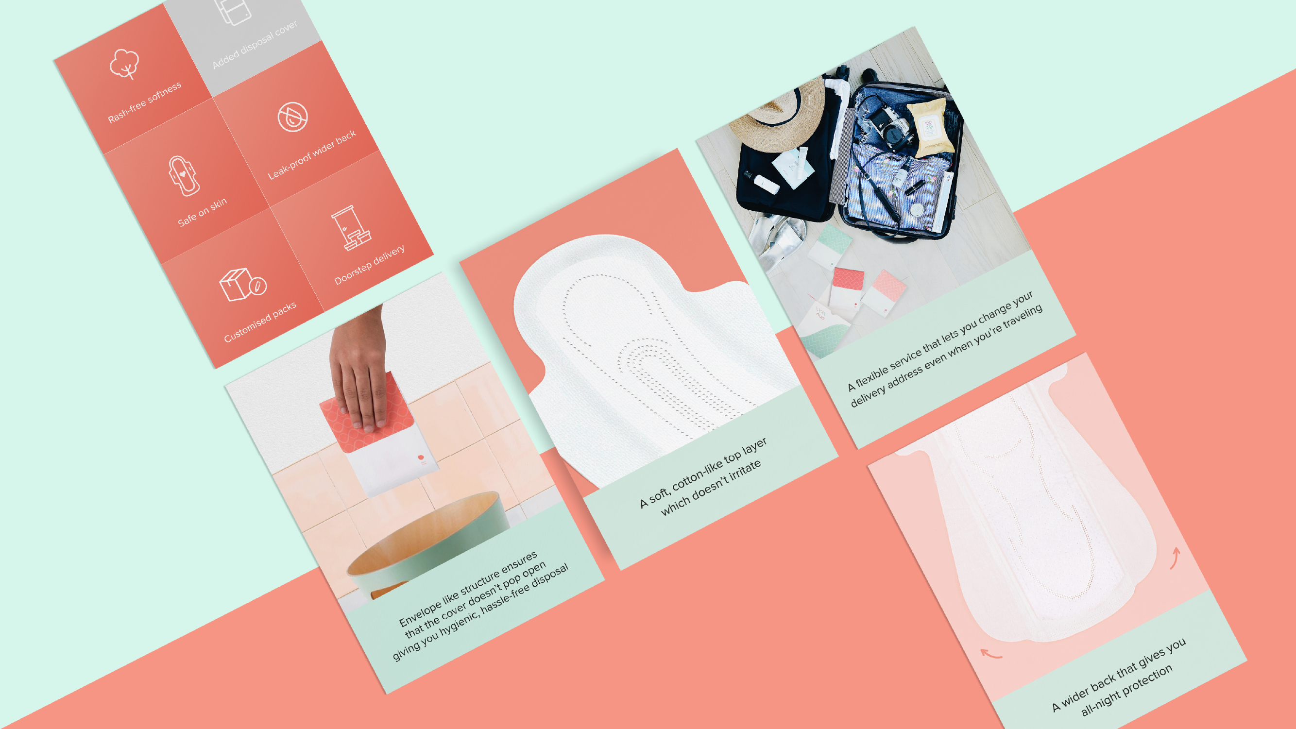
Lead with benefits: Highlighting six major problems that women face with sanitary napkins and presented them on the homepage, connecting them directly to Nua’s product benefits.
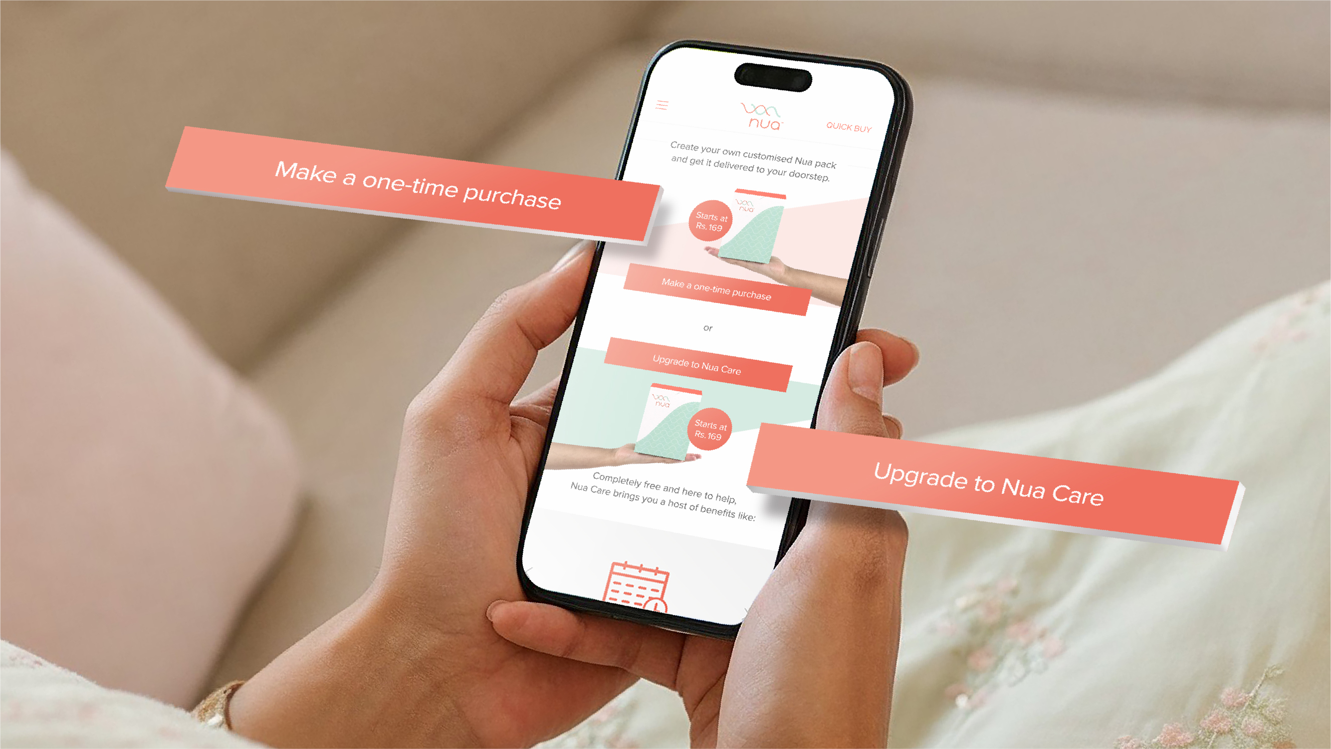
Simplified Purchase Flows: Highlighted distinct pathways for one-time purchases and subscription options to reduce decision friction.
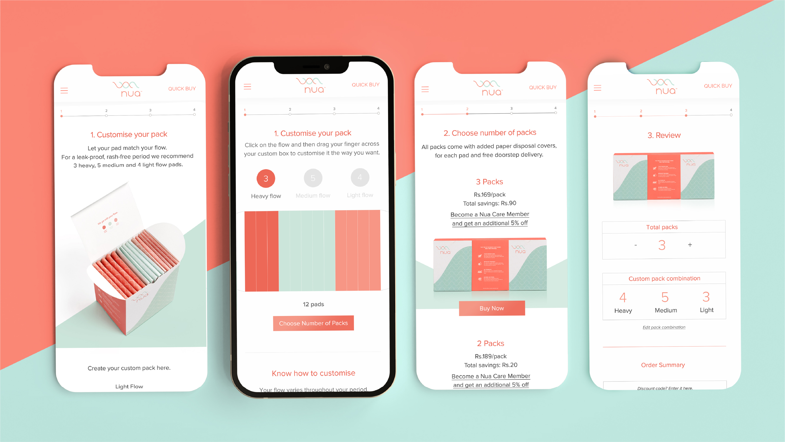
Customizable Purchase Packs: To account for each woman’s unique menstrual needs, the purchase screens allowed users to intuitively customize their packs according to flow, number of packs, and delivery frequency.
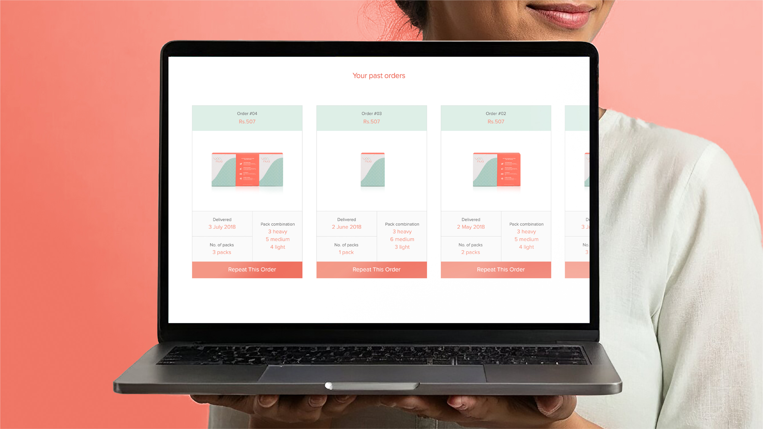
Differentiated Order History: Users could now distinguish orders from one another visually based on the number of packs purchased, making it easier for reordering.

Cycle Tracking Interface: A circular progress indicator for women that shows days until the user’s next menstrual cycle, with an accessible calendar view for in-depth tracking. Users can toggle between the cycle tracker and delivery countdowns, tying the product and its use case into one neat interaction.
