Simplifying the pillow designs for India’s top mattress brand
client
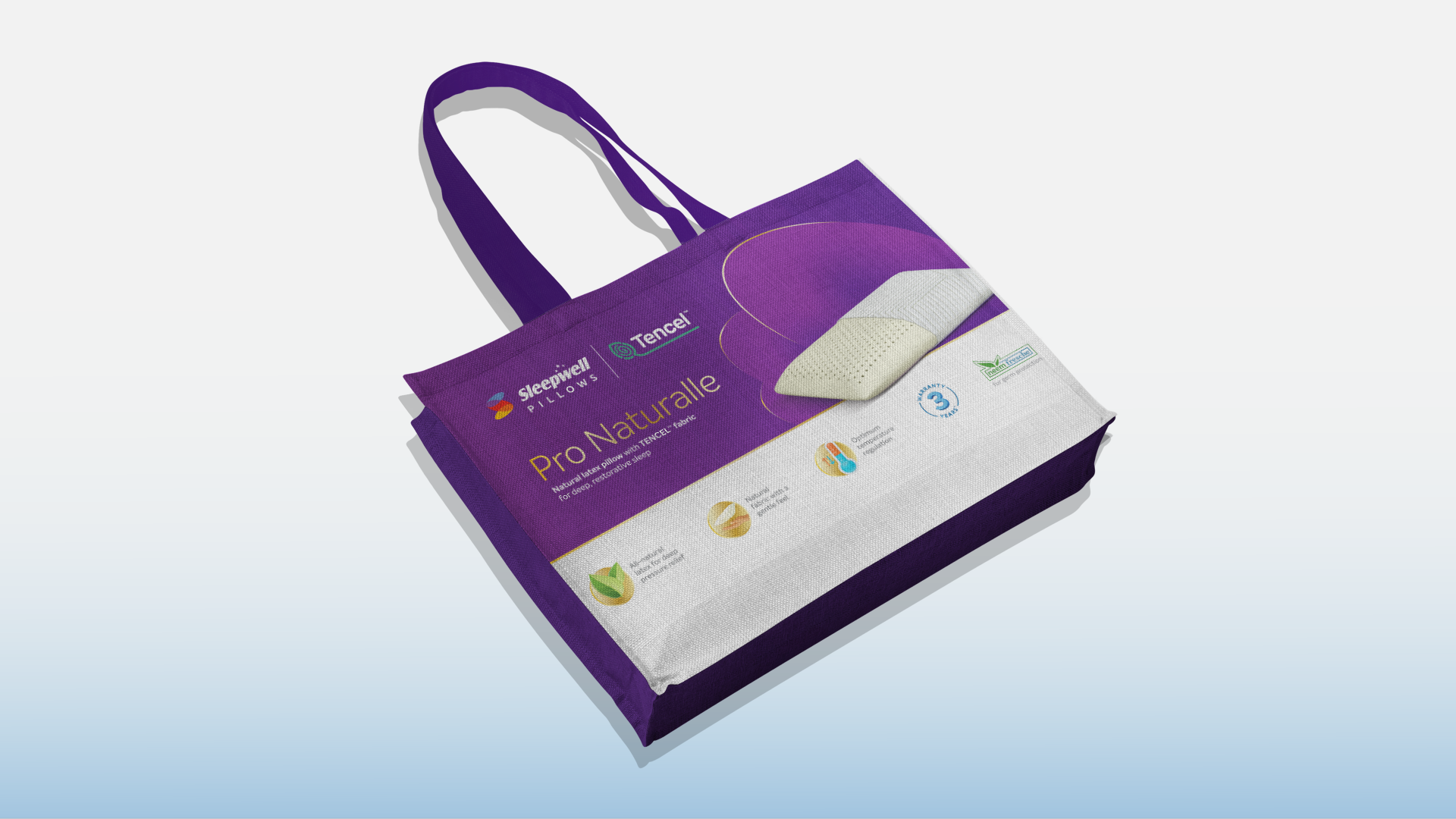
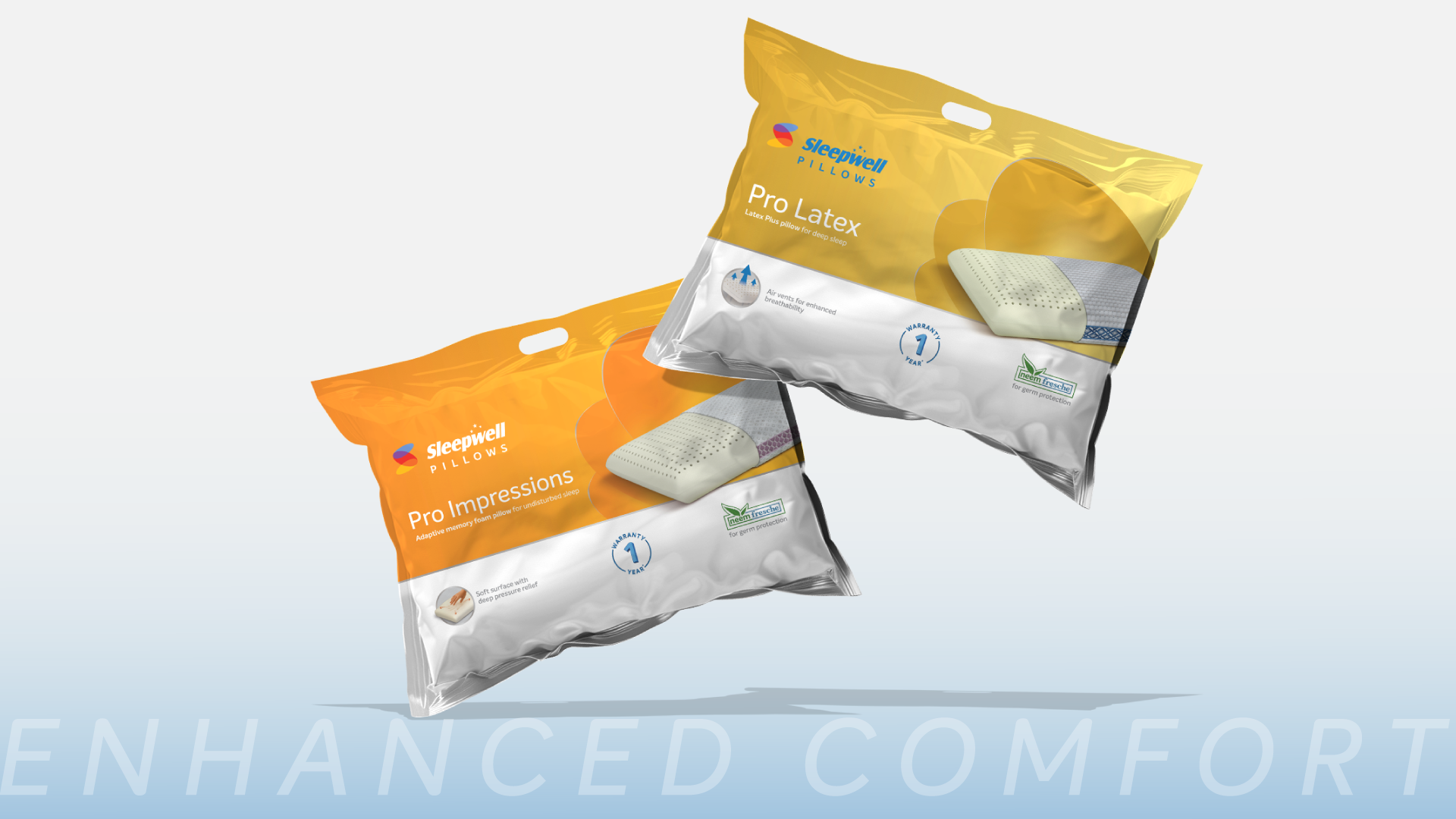
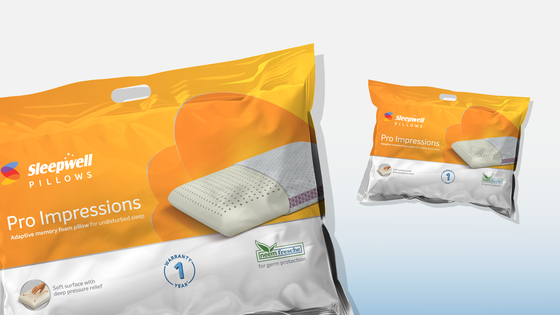
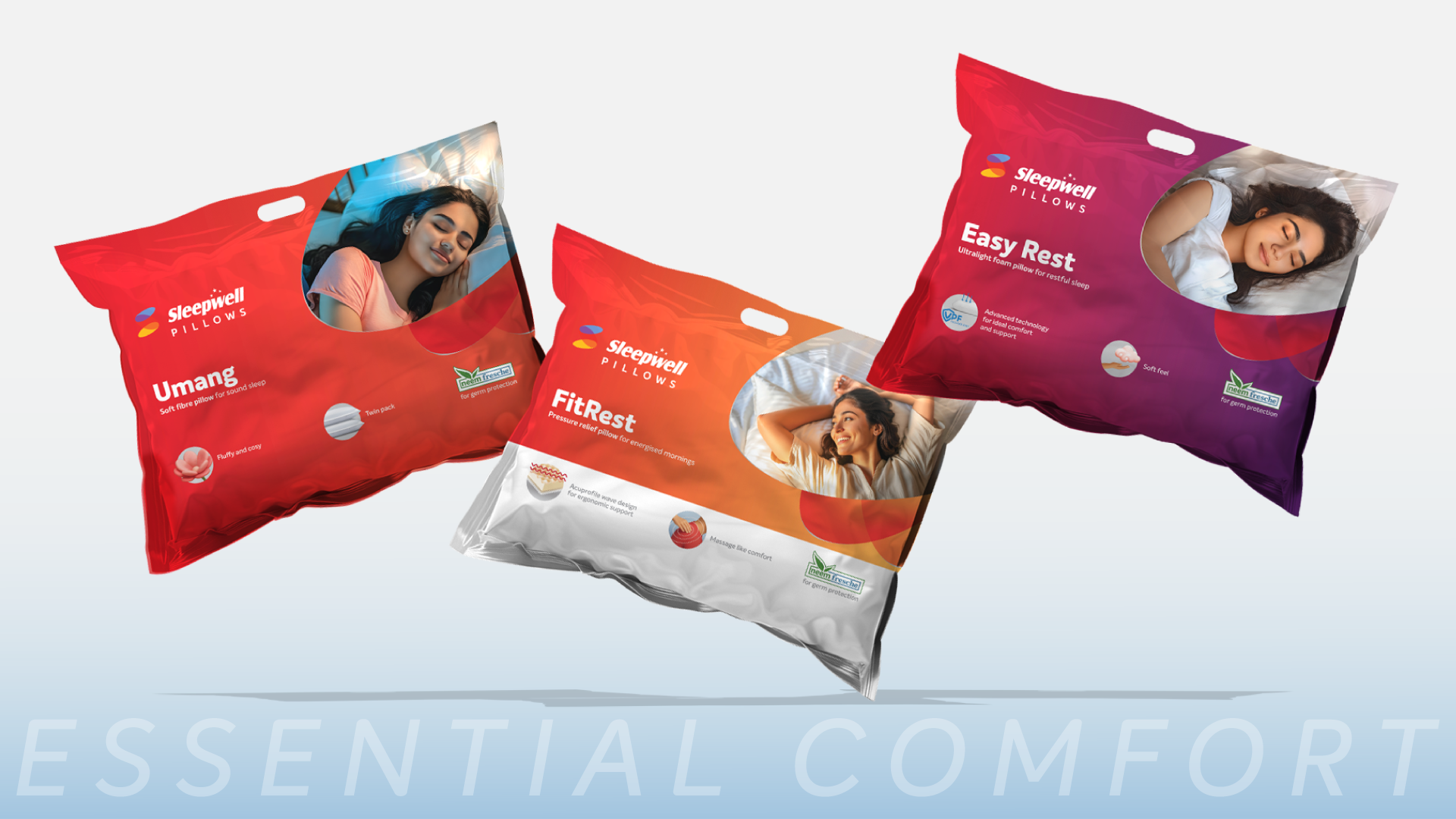
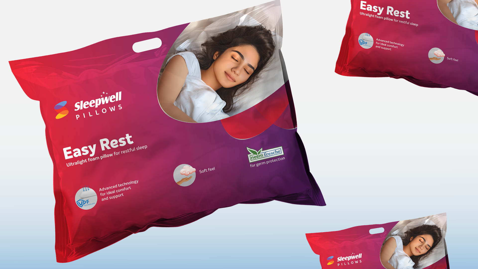
Sleepwell


01
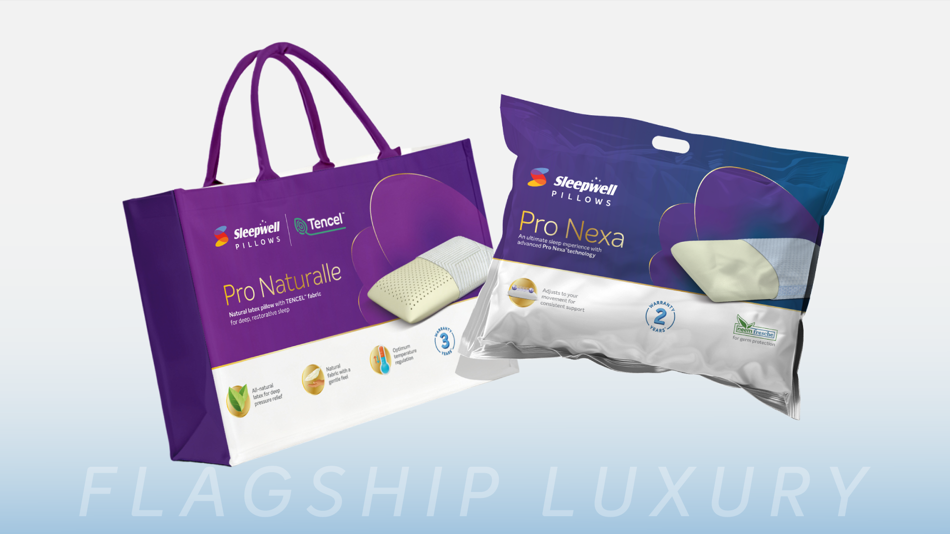
We began by incorporating the fundamental element of the Sleepwell logo, its pods, as the primary design element in the packaging.
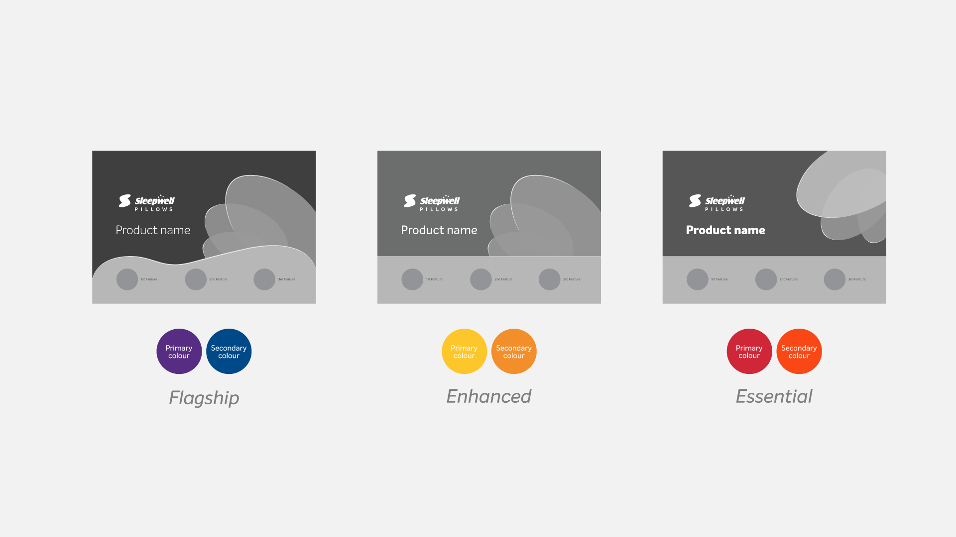
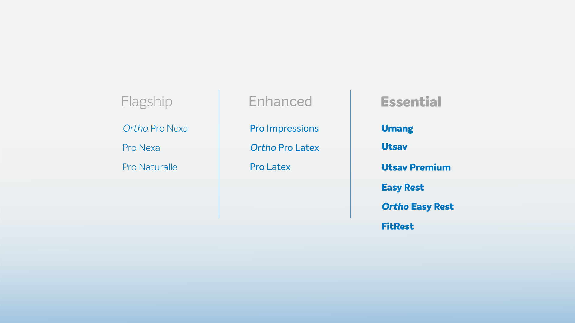
02
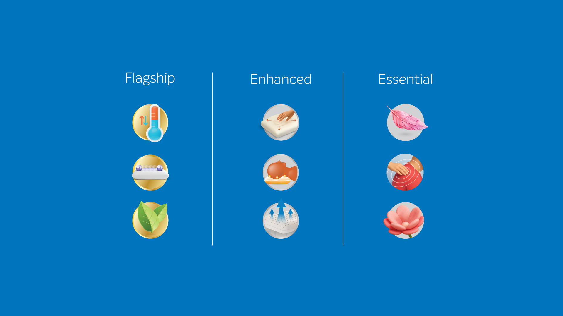
The clusters were segregated using primary colours from the Sleepwell logo. Each colour signified the level of luxury and utility of the respective category.
03
We used Intello, the primary typeface of Sleepwell. However, to create a distinction among the categories, Light, Medium, and Extra Bold weights of the typeface were used.
04
To differentiate between the categories, even in the primary-feature icons we chose a golden outline, a silver outline, and no outline for clarity.

05
06
07
08
09
10
11
12