Unifying multiple schools under one design system

Ahmedabad University was founded by AES in 2009 by unifying six different schools and ten centres of learning who had their own independent identities and websites. We unified their identity to represent their core learning philosophy and crafted a ‘student-first’ web experience.

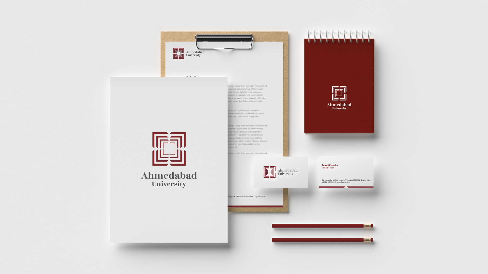
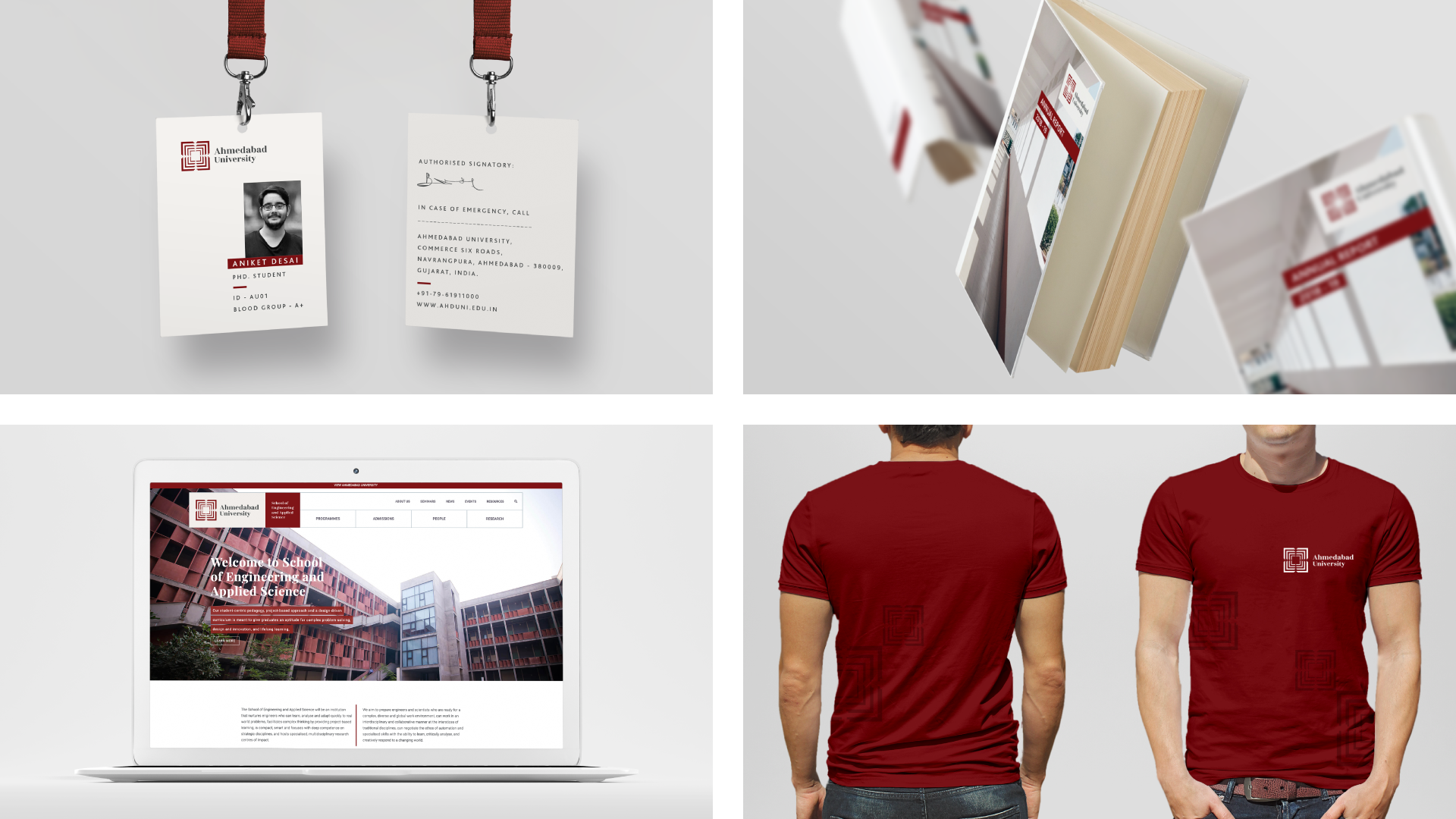
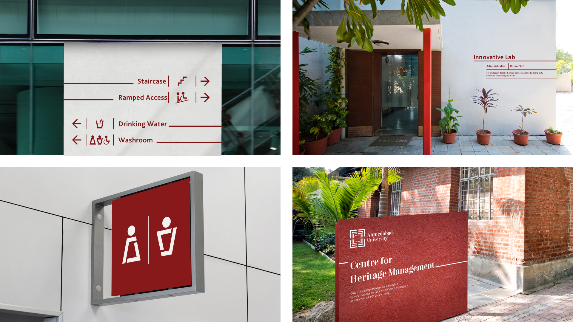
Inspired from Ahmedabad’s core: The architectural arrangement of the stepwell in the logo symbolises the relationship between self and society, their founding vision. At the core of the structure is the self, which must grow with the aim of transforming society for the better.
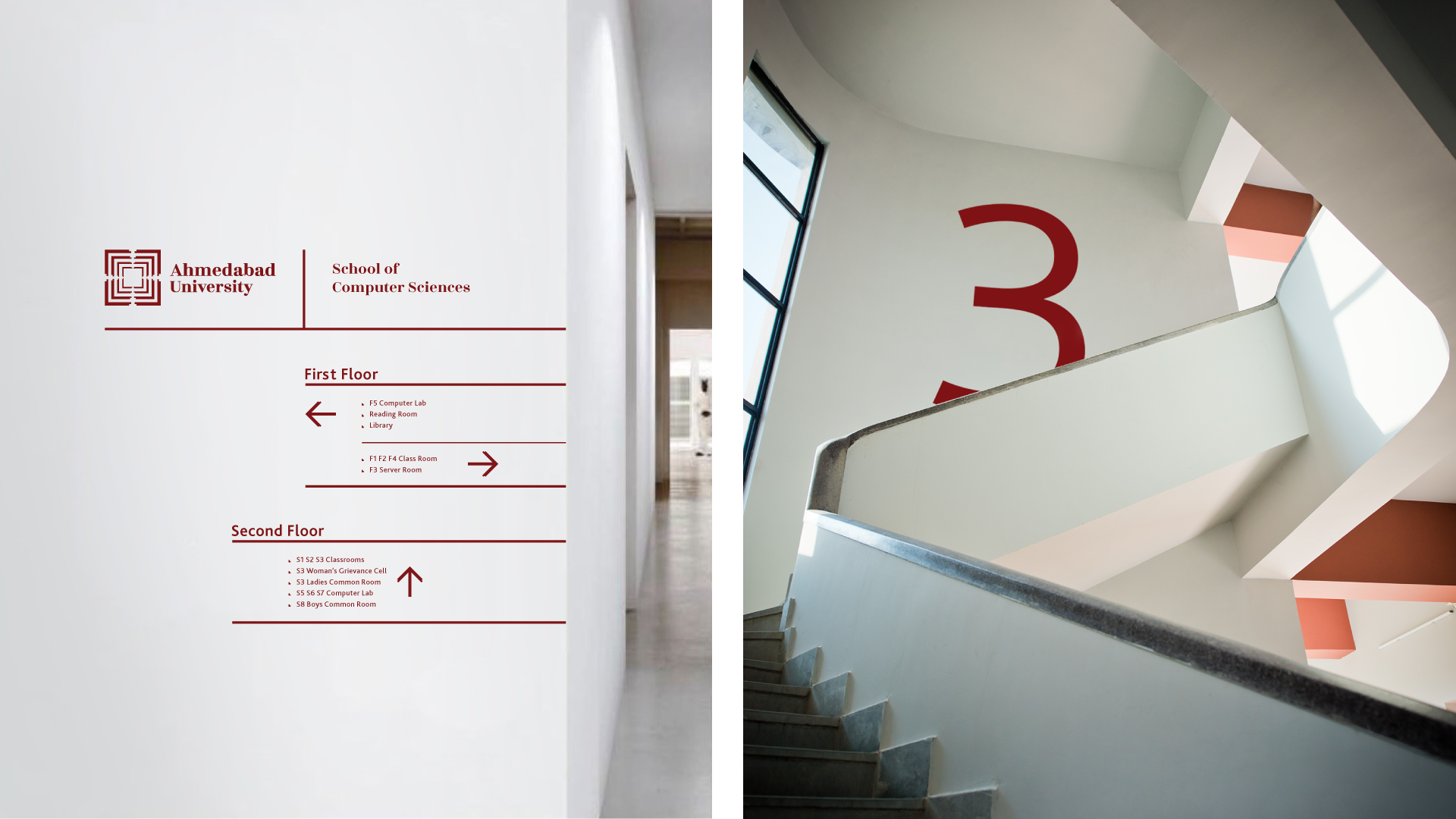
Unifying schools and centres: A homepage that reflected the richness of an inter-disciplinary university; redrew information architecture, consistent page templates and simplified navigation patterns.
People-centered visuals: Curated a photography style and page assets to be more dynamic, prioritising motion to show students and faculty interacting with the campus spaces.
Bringing alive the campus feel remotely: A 360-degree virtual campus tour allows prospective students to experience the university's infrastructure.
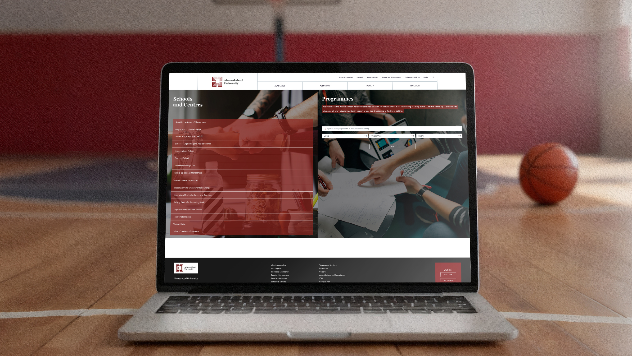
Frictionless programme exploration: A multi-dimensional filter interface so students can explore courses by level, programme, and major simultaneously.
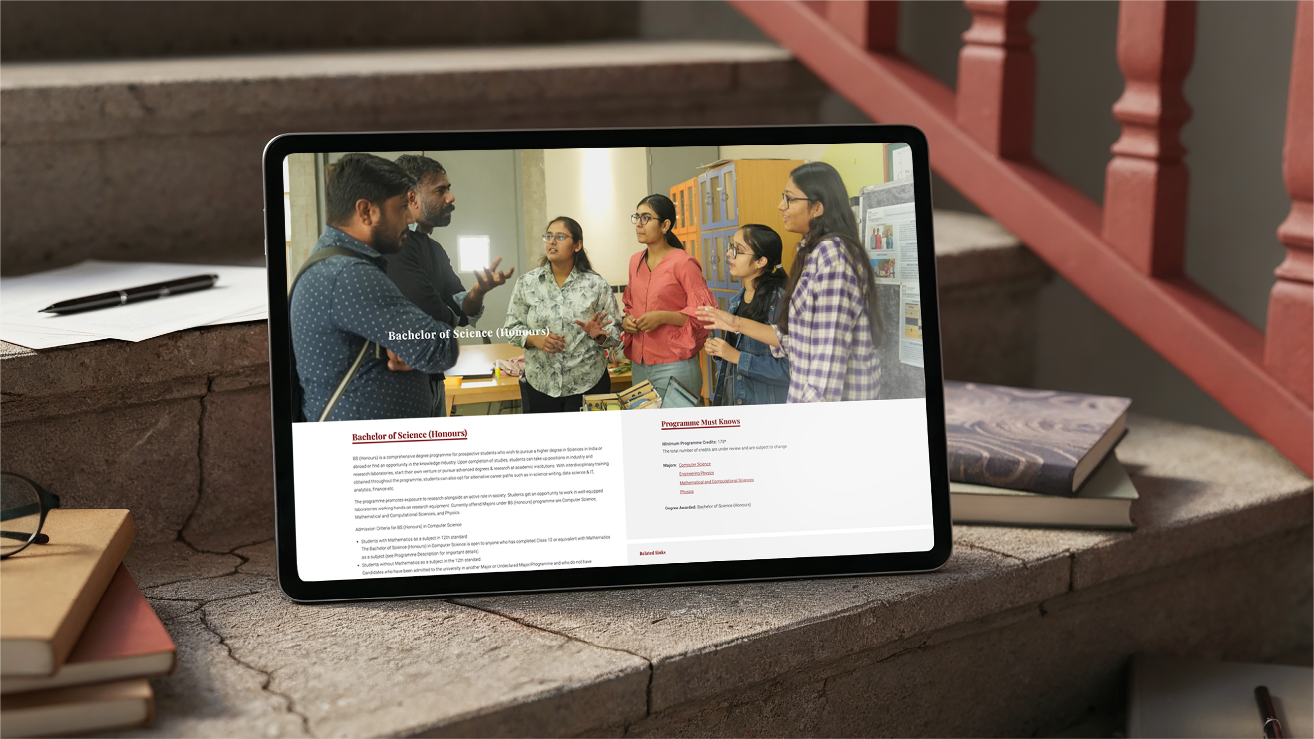
Standardized programme information for easy absorption: Course pages were standardized and consolidated into scannable single-page formats with essential details displayed as ‘Programme Must Knows’ cards.