Using E-commerce Design to make glassware approachable and intuitive
Despite pioneering glassware in India, Borosil struggled as a kitchenware brand. We redesigned the website experience around real-world behaviours and household kitchen language.

Navigation that uses kitchen language: Instead of technical terminology, we restructured the menu navigation around everyday language (drinkware, storage, dining) people actually use when thinking about their kitchen.
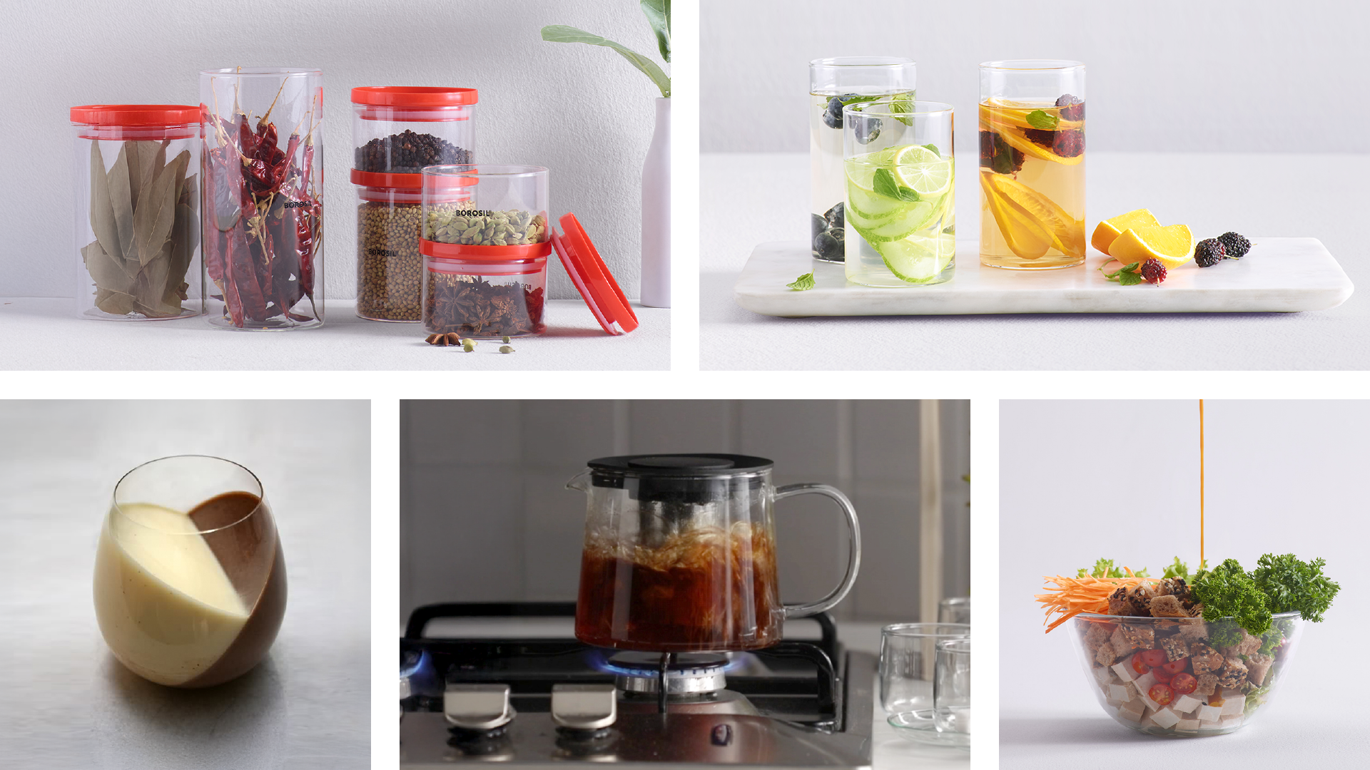
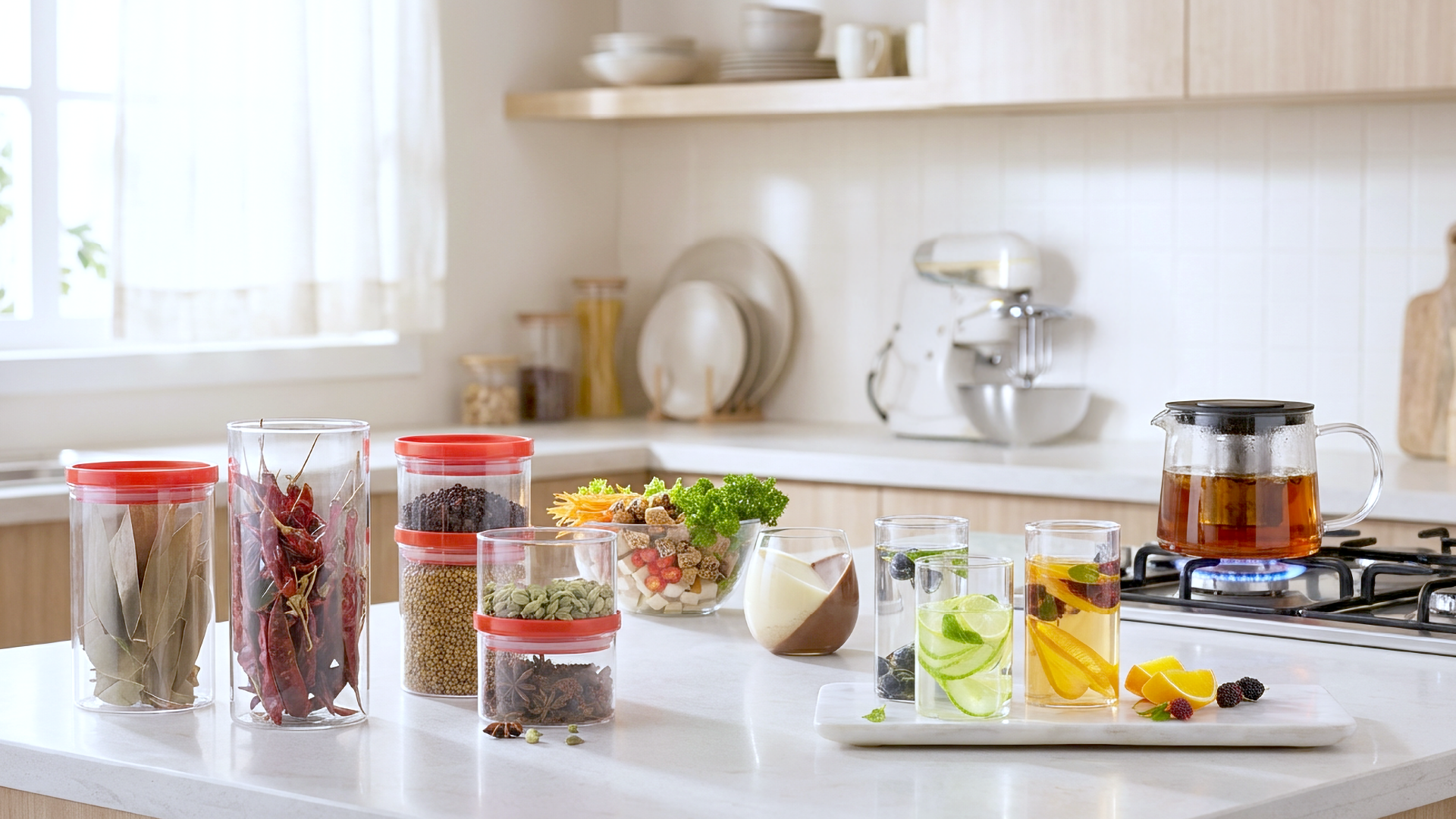
Showing glass in context, not isolation: To shatter the perception that glass was fragile and impractical for daily use, product images showed the item being used in the real world.
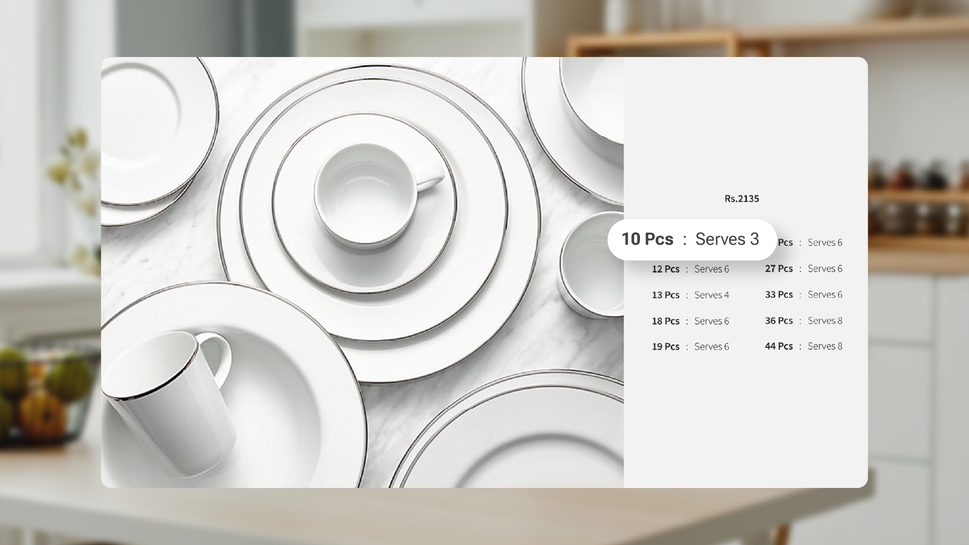
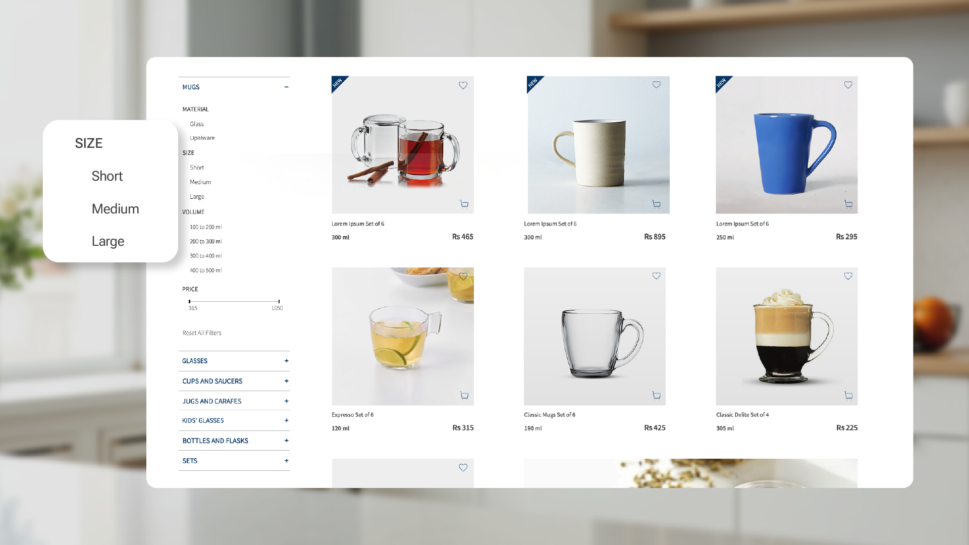
Conveying specifications in house-speak: Rewrote website copy in everyday, household language. Dinner sets displayed "serves 3" alongside "10 pieces." Glasses filtered by "short, medium, tall" instead of millilitres.
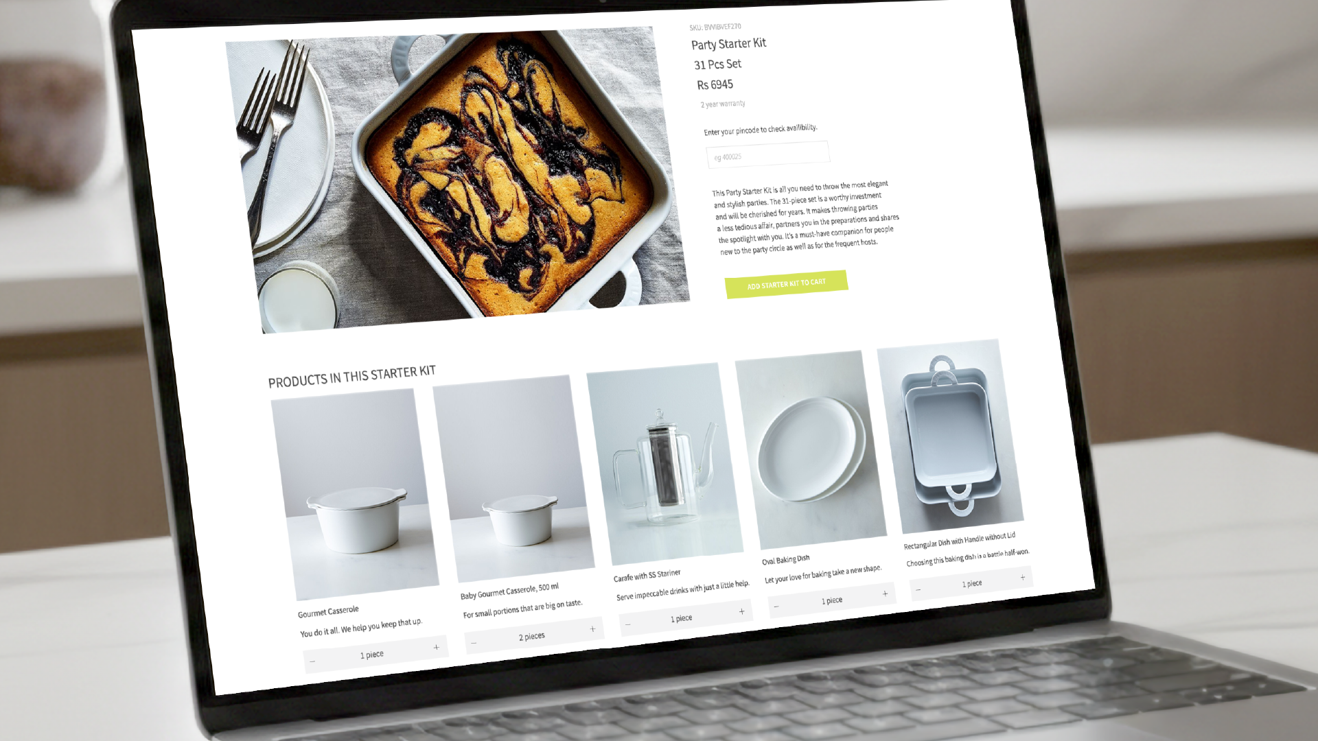
Customisation without complexity: À la carte options let users adjust pre-configured sets. The interface allows single-item additions without forcing users to abandon the set entirely and rebuild from scratch.
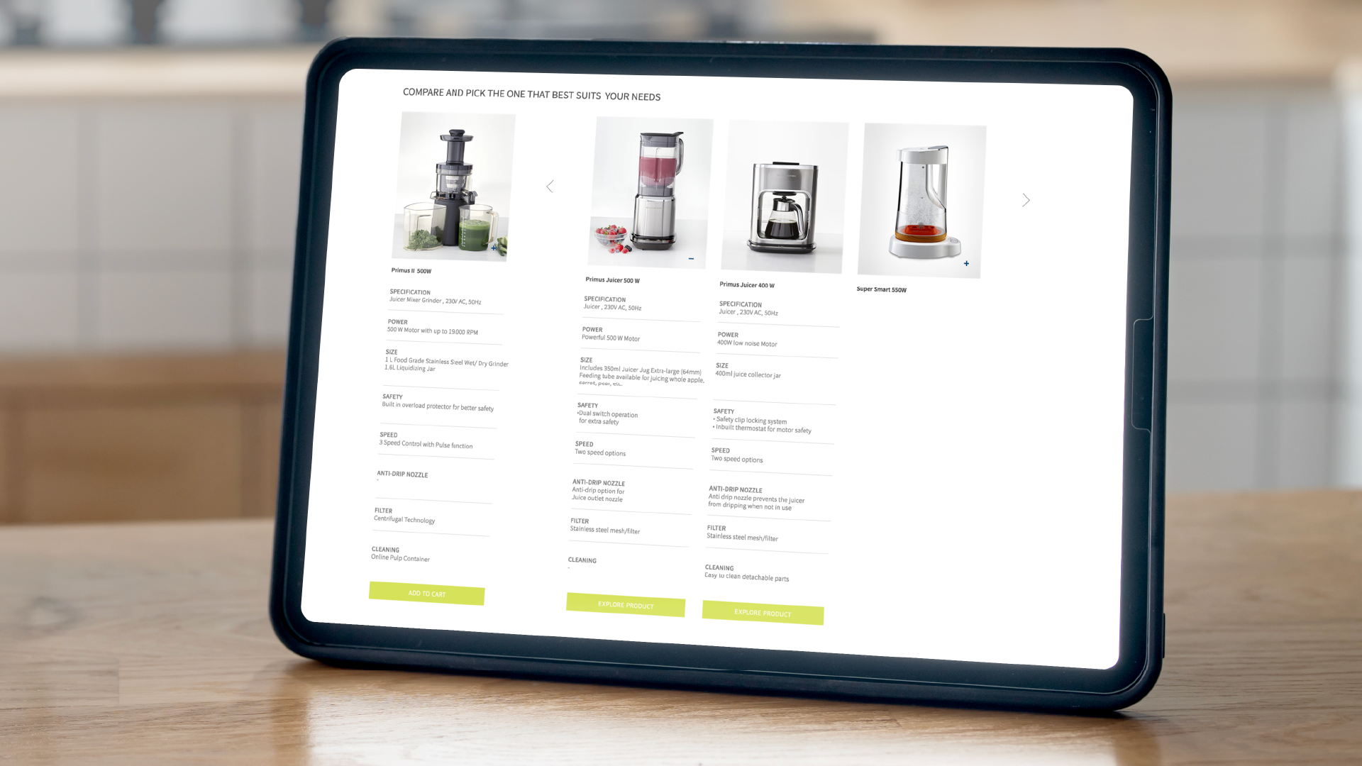
Comparison without friction: Built-in comparison tables that eliminate the need to mentally track specifications; evaluate multiple products side-by-side without opening individual product pages.